


Assistive technology that works wherever you are
Caption.Ed provides live captions, automatic transcription, and AI-powered note-taking for people who need better access to spoken information, in education, at work, and in everyday life


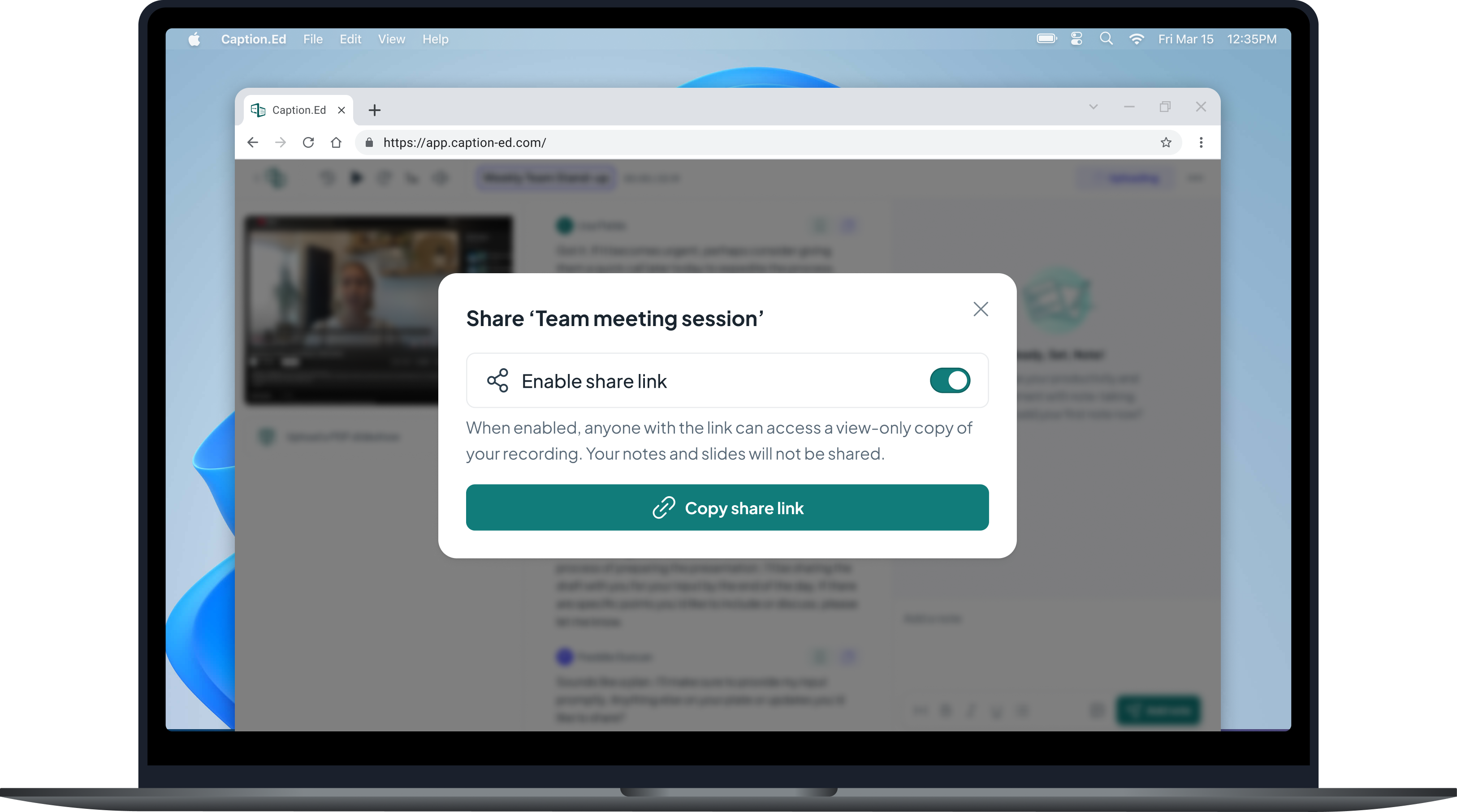
Note-taking and captioning software, designed to transform the way you work and study.
Trusted and secure
ISO 27001 certified. Enterprise-grade encryption with data access and retention controls. Data is never used to train AI models.
Designed for accessibility
Caption.Ed is designed for people with a wide range of access needs, including hearing loss, ADHD, dyslexia, auditory processing challenges, chronic health conditions, and other disabilities that affect how people access and retain spoken information.
Caption.Ed at a glance
Caption.Ed is assistive technology that gives you access to intuitive note-taking and accurate real-time captions, so you can focus on the conversation rather than trying to capture it. After any session, you have a full transcript, personalised notes and a clear list of action items, ready to use.
It works in person and online, on desktop and mobile, and integrates with Zoom, Microsoft Teams, and Google Meet.
No premium tiers, no hidden costs.
Capture what matters while staying present in the moment.
Review and retain key concepts with ease.
Whether that’s an in-person conversation, online via Zoom, Teams or Google Meet, or streaming sites like YouTube.
Easily upload slides, videos or audio recordings.
Built for students and professionals
Caption.Ed is used every day across education and the workplace to make spoken information easier to follow, revisit, and act on.
In education
Thousands of students use Caption.Ed to access lectures, seminars, and discussions on their own terms. It creates a reliable, personal record of every class without relying on a note-taker.
In the workplace
Professionals use Caption.Ed in meetings, training sessions, and one-to-ones to stay fully present and leave with a complete record of what was discussed.
Ready to get started?
Join 30,000 people who are already transforming the way they work and study with Caption.Ed.